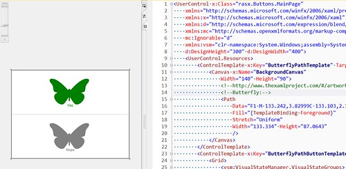
Customizing XAML Buttons? Prepare to Repeat Yourself!
Customizing XAML buttons in particular and XAML Controls in general almost immediately lead to violating the Don’t Repeat Yourself (DRY) principle. I am glad that I did not try to seriously customize buttons earlier in my Silverlight/WPF journey because the by-design depth of this problem would have seriously discouraged me from continuing with this technology.
This violation of DRY is, to me, due to the fact that the ControlTemplate cannot be completely composed out of smaller, reusable resources because:
- Any Visual State Manager
Storyboardelements cannot be shared with theStaticResourcemarkup extension (and Silverlight does not supportDynamicResource). - The
vsm:VisualStateManager.VisualStateGroupselement cannot be shared in aStyle(even though you can seeSetter Property="vsm:VisualState…"in IntelliSense). - I thought declaring
<Grid VisualStateManager.CustomVisualStateManager …>would help but nothing came from this.
What’s long-term educational about this unpleasantness is using this experience to really, really learn about the differences among Control, ControlTemplate, ContentControl and ContentPresenter. So as of this morning I understand that:
Controlis a “useless” XAML element in Silverlight because it cannot be used (it’s an abstract class in Silverlight).ContentControlhasContentTemplateandTemplateproperties. Explaining the differences between these two properties makes a smashing interview question (hint: one of these properties uses aDataTemplatefor its type).ControlTemplatelives to fill theControl.Templateproperty.ContentControlrepresents a “single piece” of visualized data—a metaphorical ‘picture’ for theContentPresenterpicture frame.
