Songhay Studio: Web Index Design Study
I’ve been using my CodePen.io site to study the next Web Index designs for kintespace.com and my Day Path Blog. This sketch represents the start of my study:
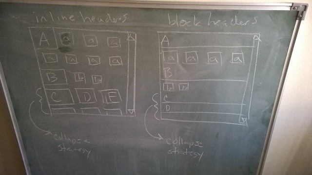
I’m seeing two designs: the Inline Header Index and the Block Header Index. The uppercase letters in the sketch represent the groupings and the lowercase letters represent the tiles that are in each group. My design borrows heavily from the current Netflix layout, the tiles of the Windows 8.x Start Menu and the ubiquitous Windows File Explorer.
The Block Header Index
My Code Pen for the Block Header Index stays true to the original blackboard sketch:
There is not much to write home about here. The code and markup should speak for itself.
The Inline Header Index
My Code Pen for the Inline Header Index strays very far from the original blackboard sketch:
The differing began with my failure to understand that inline displays do not scroll and cannot overflow. Perhaps what I am writing here can be easier understood when we see this block overflow from the Netflix user experience:

What I am trying to show you above is one row of DVD ‘tiles’ with overflow arrows on each end of the row. Is it possible to have two or more rows—a winding ‘snake’ of DVD ‘tiles, spanning several rows—terminated by overflow arrows? According to my understanding of HTML/CSS, the answer today is no.
So what I have instead are represented by the yellow inline boxes below:
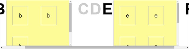
The yellow boxes represent groups, inline blocks, that overflow horizontally. I assume that Netflix did the proper UX research and concluded that that the visual assault of horizontal and vertical scrollbars would confuse users.
Apart from the majority of visitors deep-linking directly from Google, Twitter and Pinterest, kintespace.com already has a reputation for being confusing (when trying to find content from the “home” page). I assume (today) that my Inline Header Index design would be an improvement. So I am declaring here that I prefer this yellow-block design with the “crazy” scrollbars.
What’s wrong with the current index designs?
All of my web designs are works in progress. I have never been able to declare any of my web sites “finished.” That being said, it must also be said that kintespace.com in particular has been suffering from severe neglect. This site is still based on the hub and spokes paradigm of the 1990s. My design update (scheduled for 2015) is an Angular JS app that indexes, searches and presents content—so hub and spokes will be replaced by HTML5 app. This “app” should address these issues:
No “jumbo-tron” splash. The seductive, glossy-magazine effect is sorely lacking from all of my designs. I avoided this expression of compelling beauty for years of concern for bandwidth, lack of early support for responsive design and lack of an automated workflow to avoid making all of this beauty by hand.
No maximum width on tile flows. This is just lack of design experience on my part. I gave myself the challenge of designing with little help from CSS frameworks. This means I’ll be making crass mistakes for quite some time.
Monotonous tiles. Without Angular JS in my toolbox I had no viable grouping strategy for tiles. I especially wanted a design that supports data-driven, dynamic grouping (again, to avoid making things pretty by hand). Now I have Angular JS. I spent 2014 fitting it into my practice.
Colors wrong. Again, this is just lack of design experience on my part. I’ve been whining about this since 2008—so I should just call myself untalented, hire a consultant and move on? The one thing I can say in my defense is that I deliberately avoided using gradients for lack of browser support for too long. Color theory is just not comfortably in my practice to date.
Borrowing too little from Microsoft design specs. The top-level “Microsoft design principles” and the more detailed “Guidelines for Windows Runtime apps” should be regular, bedtime reading for me. Just because I won’t follow these guidelines lines blindly does not mean I shouldn’t know about them.
I’ve spent most of my IT career away from visual design and user experience research. I don’t want this historical fact to become tragic because I got into IT to explore and do visual design and user experience research. I’ve spent a mere five years working with teams who were consciously concerned about UI and UX. Along with the recent advances in IT technology, this ‘official’ concern has finally allowed me to really crank up the UI/UX practice.
I look forward to cranking it up more.