studio status report: 2020-08
month 8 of 2020 has been about defining types for the b-roll player stills API, slowly
At the beginning of month 8, I published “Flippant Remarks about Responsive Images” where I ask myself, What about all of those DTOs? The Songhay.Player.Models work that followed yields these:
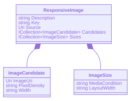
The ResponsiveImage DTOs as JSON would look like this:
[
  {
    "Description": "responsive image",
    "Key": "my-responsive-image",
    "Source": "my-responsive-image.png",
    "Candidates": [
      {
        "ImageUri": "my-responsive-image-big",
        "Width": "1920w"
      },
      {
        "ImageUri": "my-responsive-image-medium",
        "Width": "1280w"
      },
      {
        "ImageUri": "my-responsive-image-small",
        "Width": "640w"
      }
    ],
    "Sizes": [
      {
        "MediaCondition": "min-width: 600px",
        "LayoutWidth": "160px"
      },
      {
        "LayoutWidth": "320px"
      }
    ]
  },
  {
    "Description": "another responsive image",
    "Key": "my-other-responsive-image",
    "Source": "my-other-responsive-image.png",
    "Candidates": [
      {
        "ImageUri": "my-other-responsive-image-big",
        "Width": "1920w"
      },
      {
        "ImageUri": "my-other-responsive-image-medium",
        "Width": "1280w"
      },
      {
        "ImageUri": "my-other-responsive-image-small",
        "Width": "640w"
      }
    ],
    "Sizes": [
      {
        "MediaCondition": "min-width: 600px",
        "LayoutWidth": "160px"
      },
      {
        "LayoutWidth": "320px"
      }
    ]
  }
]
This looks like the data format that will transform the “face of Arrakis.” I will finally allow myself to visually design 📜📜💄 on the modern Web with curated data. And I must remind myself about the 640w-1280w-1920w progression shown above: this is a motion-picture-centric, landscape-biased responsive-image strategy.
I assert that this strategy is landscape-biased because the portrait dimensions are based on the reverse of landscape, according to the heights summarized below:
| resolution | references |
|---|---|
640x480 |
VGA or SD |
1280x720 |
720p |
1920x1080 |
Full HD, 1080p |
📖 https://en.wikipedia.org/wiki/List_of_common_resolutions
Instagram and other major social-media platforms specify 1080 x 1920 as their premiere portrait resolution:
📖 https://blog.hootsuite.com/social-media-image-sizes-guide/
The 640×480 resolution just happens to be very close to the resolution used by Twitter. Close enough:
Single and multi-image tweets: Minimum
600x335pixels, use larger images for best results
📖 https://blog.hootsuite.com/social-media-image-sizes-guide/
also:
📖 https://influencermarketinghub.com/twitter-image-size/
responsive banner images and the rule of thirds
The widths of responsive banner images are of course governed by the table above. The heights I assert might do well under the cinematic rule of thirds. And when these heights are too tall, I recommend halving them. The following table summarizes:
| resolution | standard |
|---|---|
640x213 |
VGA |
1280x240 |
720p |
1920x360 |
Full HD |
b-roll Open Graph API
What is next for the stills API is a solution for the Open Graph Image (og:image). This API should not require custom types. I am currently seeing a dictionary (Dictionary<string,string>), governed by a simple rule:
sketching out a development schedule (revision 11)
The schedule of the month:
- add Stills API to
Songhay.Player(b-roll player) 🕸🌩 - consider upgrading to .NET Core 3.0
- use
@songhay/indexas a side-car app for “Day Path” and “the rasx() context” 🚛📦 - add proposed content Web component
- use the learnings from existing npm packages to build
@songhay/player-audio-???📦✨ - modernize the kinté hits page into a progressive web app 💄✨
- convert Day Path Blog and SonghaySystem.com to HTTPs by default 🔐
- use the learnings of previous work to upgrade and re-release the kinté space 🚀